Thirty small studies of one liquid shape. Most are bad, two are the next campaign.
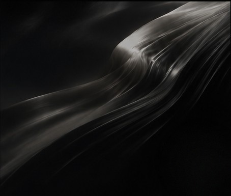
Thirty small studies of one liquid shape. Most are bad, two are the next campaign.
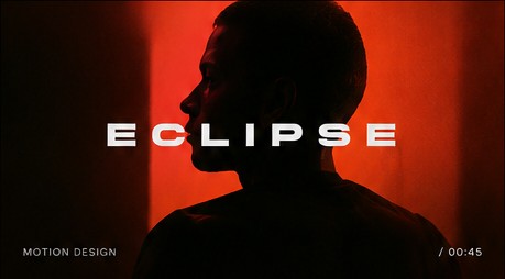
How Eclipse got its rhythm: one hard cut every 18 frames, and a single held beat of silence.
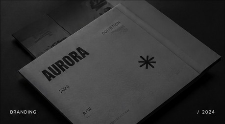
The identity is a system of margins and one paper stock. The mark came last, and then we removed it.
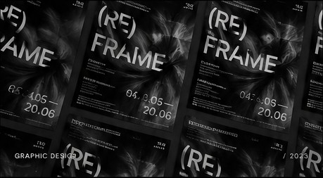
Notes on the (Re)frame poster series: matte ink, gloss varnish and what a press operator taught me.
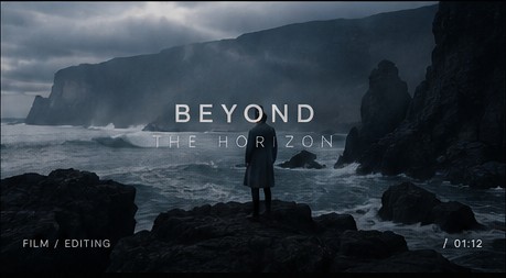
Three passes of colour on Beyond the Horizon, and why the sky is the last thing I touch.
A short list of design rules that are useful, until the moment they aren't.